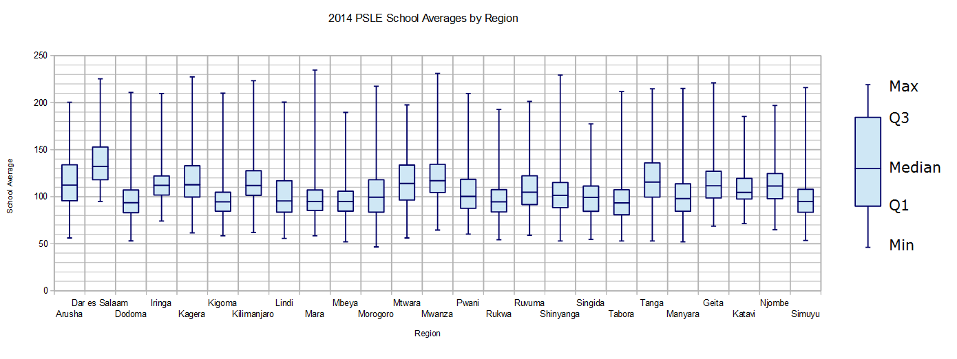
 Dar es Salaam, the country’s economic capital and largest city, is clearly the dominant region. Dar’s performance comes as no surprise; schools in Dar have historically had much better student-to-teacher ratios, educational facilities, and resources. Still, it is surprising to see how much better the schools performed in Dar compared to other regions. Dar’s worst performing school has an average that would earn it a rank near the median in almost a third of the regions and in many others it would still have a better performance than a quarter of the schools.
The plot also shows that the Arusha and Kilimanjaro regions, while performing well, did not score significantly higher than the other regions outside of Dar. These two regions benefit from a number of tourist attractions like Mt. Kilimanjaro and the Serengeti, which has resulted in a higher density of NGOs and better road networks. However, it does not appear that tourism (and the money and development that usually accompanies it) has had a significant effect on primary education, as the results for Arusha and Kilimanjaro are comparable to more remote regions like Kagera and Mtwara.
There are concerns regarding the data used to create this plot. One concern is that some of the schools had few graduates, in which case a single exceptional student could have a large impact on the school’s average. Nearly 200 schools had eight test-takers or fewer, including three schools (like Sangasanga) that only had two students take the examinations. Another drawback of this particular chart is that it includes both government and private schools. It would be preferable to plot the data from government schools only, as private schools, which are unevenly spread throughout the country, typically have dramatically better scores. Still, in its current form the chart has the benefit of showing what education opportunities are available in each region.
Dar es Salaam, the country’s economic capital and largest city, is clearly the dominant region. Dar’s performance comes as no surprise; schools in Dar have historically had much better student-to-teacher ratios, educational facilities, and resources. Still, it is surprising to see how much better the schools performed in Dar compared to other regions. Dar’s worst performing school has an average that would earn it a rank near the median in almost a third of the regions and in many others it would still have a better performance than a quarter of the schools.
The plot also shows that the Arusha and Kilimanjaro regions, while performing well, did not score significantly higher than the other regions outside of Dar. These two regions benefit from a number of tourist attractions like Mt. Kilimanjaro and the Serengeti, which has resulted in a higher density of NGOs and better road networks. However, it does not appear that tourism (and the money and development that usually accompanies it) has had a significant effect on primary education, as the results for Arusha and Kilimanjaro are comparable to more remote regions like Kagera and Mtwara.
There are concerns regarding the data used to create this plot. One concern is that some of the schools had few graduates, in which case a single exceptional student could have a large impact on the school’s average. Nearly 200 schools had eight test-takers or fewer, including three schools (like Sangasanga) that only had two students take the examinations. Another drawback of this particular chart is that it includes both government and private schools. It would be preferable to plot the data from government schools only, as private schools, which are unevenly spread throughout the country, typically have dramatically better scores. Still, in its current form the chart has the benefit of showing what education opportunities are available in each region. 2014 PSLE Regional Performance
Last month the Primary School Leaving Examination results were announced. A number of articles reported on the top performing schools and regions (see: Standard VII Results Improve by 6pc) and NECTA has posted a map of pass rates by district to show how performance varies geographically. While pass rate is the most used statistic when describing examination results, presenting a single number doesn’t give insight into how a population is distributed.
One way to graphically display distribution information is a box and whisker plot. In the simplest type of box and whisker plot, the ends of the whiskers (the lines extending either side of the box) show the minimum and maximum values of the dataset. The box itself has three horizontal lines indicating the first, second, and third quartiles (Q1, Q2, and Q3), which are the points that divide an ordered set of data into four subsets with an equal number of elements. The second quartile, which is the horizontal line inside the box, is the median. For a more detailed description of box and whisker plots check out the Khan Academy Videos on the topic.
Below is a box and whisker plot that shows the distribution of school averages in each region of Tanzania. In the future we’ll make another plot using pass rates for each school, but for this initial attempt it was easier to scrape the averages as they were already calculated and posted on the results page for each school on NECTA’s website (example page).
 Dar es Salaam, the country’s economic capital and largest city, is clearly the dominant region. Dar’s performance comes as no surprise; schools in Dar have historically had much better student-to-teacher ratios, educational facilities, and resources. Still, it is surprising to see how much better the schools performed in Dar compared to other regions. Dar’s worst performing school has an average that would earn it a rank near the median in almost a third of the regions and in many others it would still have a better performance than a quarter of the schools.
The plot also shows that the Arusha and Kilimanjaro regions, while performing well, did not score significantly higher than the other regions outside of Dar. These two regions benefit from a number of tourist attractions like Mt. Kilimanjaro and the Serengeti, which has resulted in a higher density of NGOs and better road networks. However, it does not appear that tourism (and the money and development that usually accompanies it) has had a significant effect on primary education, as the results for Arusha and Kilimanjaro are comparable to more remote regions like Kagera and Mtwara.
There are concerns regarding the data used to create this plot. One concern is that some of the schools had few graduates, in which case a single exceptional student could have a large impact on the school’s average. Nearly 200 schools had eight test-takers or fewer, including three schools (like Sangasanga) that only had two students take the examinations. Another drawback of this particular chart is that it includes both government and private schools. It would be preferable to plot the data from government schools only, as private schools, which are unevenly spread throughout the country, typically have dramatically better scores. Still, in its current form the chart has the benefit of showing what education opportunities are available in each region.
Dar es Salaam, the country’s economic capital and largest city, is clearly the dominant region. Dar’s performance comes as no surprise; schools in Dar have historically had much better student-to-teacher ratios, educational facilities, and resources. Still, it is surprising to see how much better the schools performed in Dar compared to other regions. Dar’s worst performing school has an average that would earn it a rank near the median in almost a third of the regions and in many others it would still have a better performance than a quarter of the schools.
The plot also shows that the Arusha and Kilimanjaro regions, while performing well, did not score significantly higher than the other regions outside of Dar. These two regions benefit from a number of tourist attractions like Mt. Kilimanjaro and the Serengeti, which has resulted in a higher density of NGOs and better road networks. However, it does not appear that tourism (and the money and development that usually accompanies it) has had a significant effect on primary education, as the results for Arusha and Kilimanjaro are comparable to more remote regions like Kagera and Mtwara.
There are concerns regarding the data used to create this plot. One concern is that some of the schools had few graduates, in which case a single exceptional student could have a large impact on the school’s average. Nearly 200 schools had eight test-takers or fewer, including three schools (like Sangasanga) that only had two students take the examinations. Another drawback of this particular chart is that it includes both government and private schools. It would be preferable to plot the data from government schools only, as private schools, which are unevenly spread throughout the country, typically have dramatically better scores. Still, in its current form the chart has the benefit of showing what education opportunities are available in each region.
Another potential reason that Dar es Salaam performs better than many other regions is that it has a comparatively low Gross Enrollment Rate (GER – the ratio of the number of students in primary school over the population aged 7-13). The 2013 Basic Education Statistics for Tanzania reported the GER for Dar es Salaam was 77.8%, much lower than the national average of 97.2%. Only one other region, Kigoma, had a lower GER. It’s possible that students who are performing poorly in Dar are dropping out.